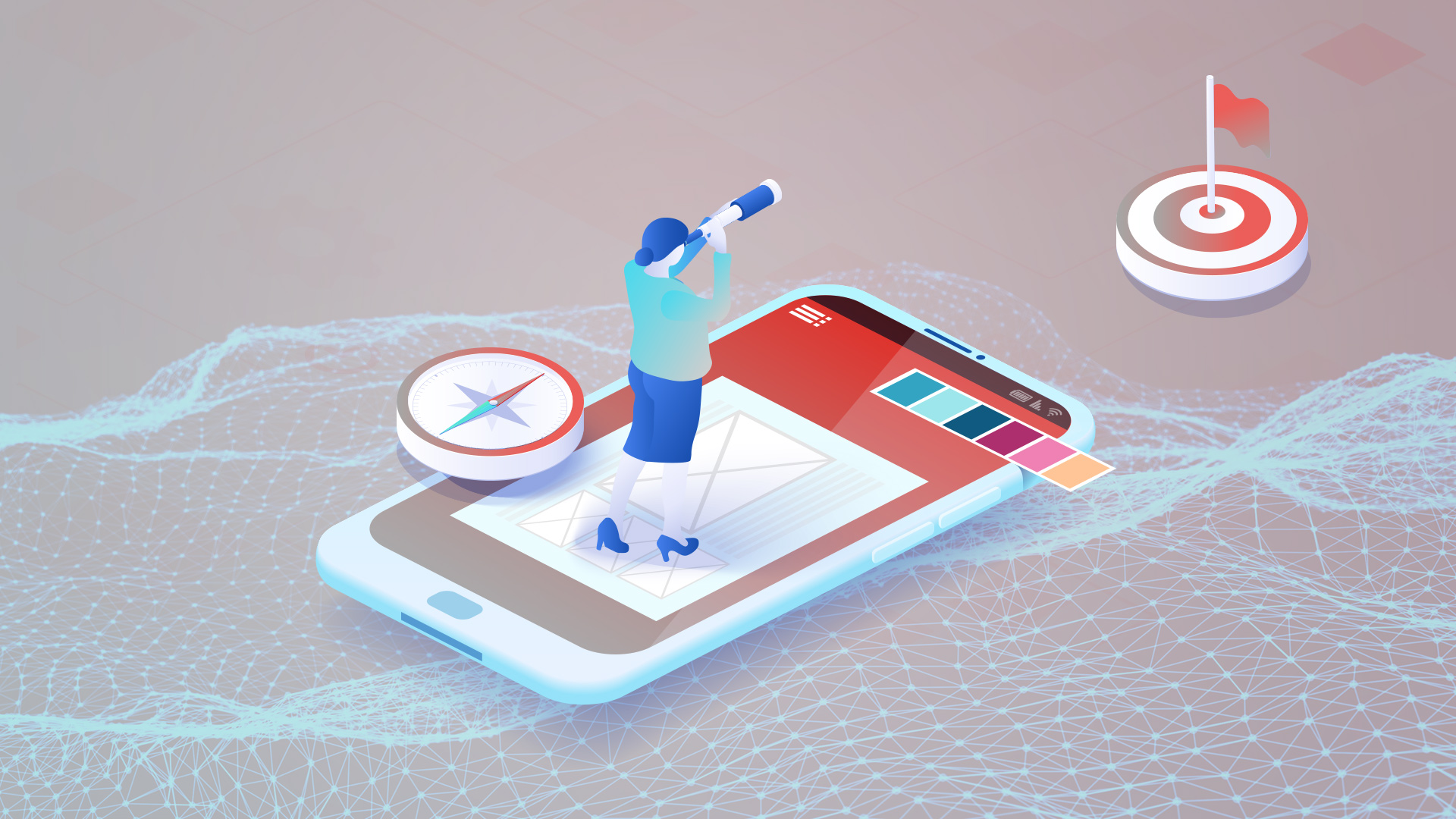
Can UX design help convert web traffic into satisfied customers? Imagine you are the captain of a ship in a vast digital ocean, ruling the waters as an online store owner. Your goal is to make sure that when a sailor arrives at your page, they is enticed to venture further and discover your products, finding the treasures of your brand and in the end, leaving your port with what they were looking for and a smile on their face.
However, you have noticed that despite receiving a multitude of sailors and offering endless virtual treasures, purchases are scarce? Have you ever wondered why you can’t turn so many explorers into bold, satisfied digital collectors?
The problem could be related to UX design. It is essential to have a focus on creating digital products and services that are easy to use, efficient and enjoyable for users. It’s like a compass that guides navigators throughout our digital ocean, ensuring that routes are clear, experiences are satisfying, sales are increased and navigation is intuitive. At Mijo! we want to take you on a tour of 4 key points that can be applied in UX design to boost your conversions.
1. Simplify navigation
In UX design, it is important to simplify website navigation by optimizing usability and information architecture. Simplifying navigation involves creating a user experience in which users can move effortlessly and intuitively; This is called usability. Meanwhile, information architecture helps organize and structure content so it’s easy for sailors to find what they need.
Puerto Vallarta Villas is a real estate agency who we have maintained a happy collaboration with for several years. Recently, they contacted us with the need to revamp their website. Listening to their team, we found that one of their areas of improvement was their navigation menu and use of call-to-action buttons. Let’s take a look at their page, a clear example of how to use call to action buttons. When you navigate through the website, the menu acts as a compass, always remaining in a fixed position. Additionally, the “Contact Us” button stands out like a beacon, available anywhere on the site to contact the agency. Simple and practical, like having a good tailwind in web browsing!
2. Fast loadingspeeds
Imagine you are sailing through digital waters. The loading speed of your site is like the speed which your boat moves through the ocean. Now, think of users as adventurers eager to explore what you have to offer. If your ship (or website) moves slowly, crew members become impatient and may abandon the ship before reaching their destination. A snappy website not only keeps users engaged, but it can also turn those visits into higher conversions!
Alias Intelligence is one of our clients with whom we worked on adapting their website to a more mobile-friendly version. We not only make sure your site looks flawless on any device, but also improve its loading speeds, weathering through waves of challenges, even with several animations on board.
3. Highlight calls to action
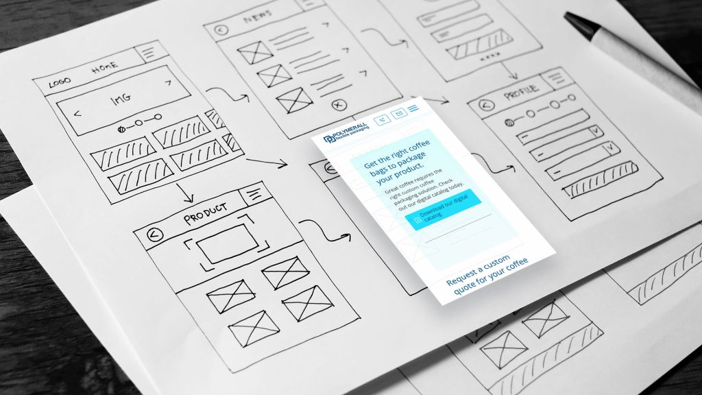
Just as a navigation map has routes mapped out, calls to action are meticulously incorporated into prototypes to experiment and refine their placement, evaluating whether they are visible enough, whether their position is intuitive, or whether the instructions are accurate. It’s essential that a call to action is clear, persuasive and stands out visually to effectively guide users to the next step and, of course, successfully generate more conversions!
At Mijo! we worked with Polymerall to improve various aspects of their website. One of the key challenges was deciding where to anchor the calls to action. Their website has an online catalog of all their available products, and we had to be strategic about highlighting calls to action amidst so much information, graphics, and other elements. It was like looking for the North Star in the middle of a storm, but thanks to the prototypes we implemented and great teamwork, we came up with the best strategy to highlight calls to action.

4. Mobile optimization
Mobile optimization is similar to the job of a deckhand who adjusts the sails and rudder so you can navigate smoothly in rough waters. Similarly, mobile optimization is responsible for fine-tuning the interface, content and functionalities so that users can easily navigate the vast ocean on mobile devices. When you offer a high-quality experience, you increase the chances that digital surfers will “pin” to your site and convert.
On one of our missions with Lynn Valley Counselling, we dove into a project focused on UX/UI design. We had several goals, but one of the most important was to facilitate the main task: scheduling appointments. To achieve this, we made sure that the browsing experience on both the website and mobile versions was as easy and simple as the stars on a clear night. This allows users to easily navigate and discover the services offered, just like sailors identifying each constellation ocean sky.
UX Design in Action: We are Your Guide to Digital Success!
After this dive into UX design, we concluded that it is essential to increasing conversions. It is a useful tool to guide and direct applications, websites, online stores, etc., towards success and increase the desired outcomes. However, it is necessary to explore other areas to have a clearer picture of what we need to improve.
Like sailors in the ocean of customer needs, more than half of those who arrive at the port of Mijo! Brands discover that they require something different than they originally thought. However, we discovered that until we have to investigate further to find out what that is. If you have questions about improving the UX design of your platform, contact us so we can chart the perfect course for your success. Ready to set sail?


